The concept that stood out for me was that a single visualization can live anywhere between science and art, or everywhere in between. They used the example of the wind map to illustrate this. Data through a visualization that is offered in real-time makes it easy to appropriate. And when you can get this personal connection to the data, then you can use it for a variety of purposes: utilitarian, scientific, predictive, social, artistic.
Highlights:
The talk followed the three subjects in the title, "visualizations available to the public", "visualizations that are social, interactive, and personal (relates to your experience), and visualizations that are collaborative (Wikipedia being one of the examples). They also covered accessible visualizations in their newest endeavor at Google which is Google Sheets Explore (released 3 weeks ago). My example here.
http://hint.fm/seer/ a visualization of Google search that shows relative weight in the predictive search algorithm. Useful for comparing two similar searches.
Data visualization as sharing: The babyname wizard voyager that was used for much more than naming babies.


Choice vs automation: Their work in setting up automated graphing in Google spreadsheets. As they were talking about this I was thinking, "I don't want someone else telling me what to see in my data". However, after they were done explaining I was left with two thoughts. 1. If anyone is going to interpret my data, these are two of the people who I would want to do it. 2. The prose that is written actually takes some of the work out of counting up the data and looking for trends, which can be limiting when data gets large.
An interesting side note on the work that they are doing to automate is that messy data can actually give them clues as to what the user's intent was. For example if there is a totals row in the data they can surmise that the user might want stacked data as opposed to line plots.
User interaction, user generated data, and collaborative data. Fernanda and Martin's successes with a project called Many Eyes done at IBM seem to drive a lot of what they are doing now. In this project, which is no longer available, they gave users the ability to upload any kind of data and visualize it with a wide variety of common and not-so-common methods. It was widely used by scientists, for comparing texts, for visualizing all kinds of info.
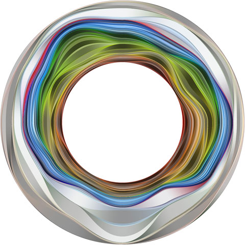
In the "creative coding" category they presented a visualization of the Boston seasons in a single abstract color wheel. See more details here: http://hint.fm/projects/flickr/
Original Announcement:
https://www.seas.harvard.edu/calendar/event/84246Visualization for Everyone: Public, Social, and Collaborative Computer Science Colloquium Series Fernanda Viégas and Martin Wattenberg, Google Monday, September 21, 2015 - 4:00pm to 5:15pm Maxwell Dworkin G115 As data plays an ever larger role in society, there’s a critical need for tools to help people understand and reason about complex information. Our research seeks to make data visualization--originally a tool for experts--accessible to everyone. To succeed as a mass medium, visualization must be simple to use, easy to share, and suited to the kinds of data that people care about. We will discuss these challenges and projects which address them. First, we’ll present work that explores the collaborative dimension of visualization. Second, we’ll consider socially important forms of data such as text and images that don’t fit traditional visualization approaches. We present new techniques to provide insight into media from books to photographs. Finally, a radical level of simplicity in both authoring and consumption is required for visualization to succeed on a massive scale. We’ll illustrate solutions to these challenges with data sets ranging from wind flows to global cyberattacks. This approach to visualization points the way to a future where every citizen can fully participate in a data-driven society. Speaker Bio: Fernanda Viégas and Martin Wattenberg are the leaders of Google's “Big Picture” data visualization research group, which invents new ways for people to understand and explore data. They are well known for their contributions to social and collaborative visualization, and the systems they’ve created are used daily by millions of people. Before joining Google, the two founded Flowing Media, Inc., which focused on media and consumer-oriented projects. Prior to Flowing Media, they led IBM's Visual Communication Lab, where they created the ground-breaking public visualization platform Many Eyes, which introduced visualization to millions of users worldwide. Viégas has been named by multiple publications as one of the most influential women in technology. Her visualizations of email and online conversations led the way for new social media interfaces. Wattenberg, as a director of R&D at Dow Jones, created some of the earliest visualizations for digital journalism. Viégas holds a Ph.D. from the MIT Media Lab; Wattenberg has a Ph.D. in mathematics from U.C. Berkeley. Their academic work has won multiple “best paper” accolades, and they’ve received several top design and technology awards. Their visualization-based artwork has been exhibited worldwide, and is part of the permanent collection of Museum of Modern Art in New York. Host: Hanspeter Pfister